-
RAG vs. Agentic Models: Choosing the Right AI Approach

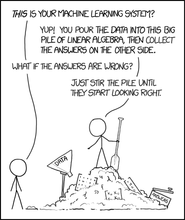
Source:XKCD In a time where we are innudated with a variety of choices for AI adoptions, it is important to know how they fit into our applications. Imagine if your AI assistant can either be a know-it-all lawyer with perfect recall or a resourceful Sherlock Holmes who can solve complex problems on the fly. Should you implement Retrieval-Augmented Generation (RAG) or agentic models? It's a bit like choosing between having an encyclopedic friend or a clever problem-solver as your sidekick.
RAG systems are the brainiacs of the AI world, fetching relevant content from vast knowledge sources to generate accurate, factual responses. They're all about grounding outputs in real data that provides context. Agentic models, meanwhile, are the clever tinkerers who can reason through (complex) problems, use tools, and figure things out step by step. They're the "let me think about this and get back to you with a solution" type of AI.
-
A tale of two regulatory initiatives
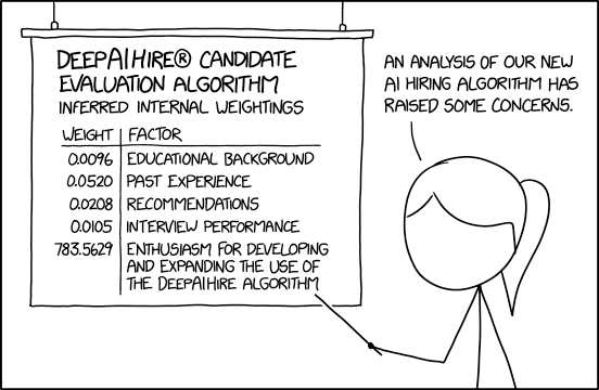
Source:XKCD Imagine a world where robots walk among us as charming assistants who can make and deliver a good cup of java. Sounds awesome, right? Well, the future of AI is about to get a lot more interesting, thanks to two major initiatives: the EU's ambitious AI Act, which basically slaps a leash on rogue algorithms, and President Biden's Executive Order (EO) on AI, which is like a friendly nudge towards responsible AI practices (think of it as a government-issued "Please Don't Skynet Us" guidance).
The EU Act is like a grumpy old grandpa, all rules and penalties, demanding transparency and accountability from high-risk AI apps. It's got teeth, too, with hefty fines for AI that goes rogue or starts social scoring people's personal lives. Biden's EO, on the other hand, is like a chill surfer dude, all vibes and best practices. It encourages federal agencies to be mindful of bias, fairness, and the potential for not accidentally creating an army of robot overlords.
This clash of styles – regulation versus guidance – raises fascinating questions about the future of AI governance: will the EU's stern hand prevail, or will Biden's laid-back spirit guide us to a future where AI helps us fold laundry and write limericks, not enslave us and hack our DNA? This blog will look at the two approaches and explore the implications for the near future of AI.
-
The pursuit of art in Artificial Intelligence

Example of a GAN portrait from my training of a ProGan model. In recent years, AI and machine learning has expanded into many pockets of modern society. One niche area that has been quietly transformed by AI is the art world. Many algorithms have emerged that can generate original content, whether it is visual art 🎨 or music 🎶 (e.g. Jukebox from openAI). Since I enjoy art as a hobby, I decided to go down the rabbit hole and explore the quirky world of AI Art.
-
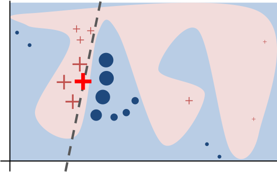
Model explainability for decision trees and neural network
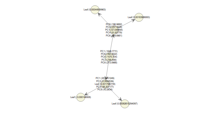
Source:XKCD As AI and machine learning alogrithms are becoming ever more ubiquitous, we as a society start to scrutinize more on how these black-boxes arrive at its predictions, and whether or not we can trust it. To that end, an assortment of algorithms have sprung up to address model explainability such as LIME, Permutation feature importance, and SHAP (SHapley Additive exPlanation) values. The SHAP value method stands out because it returns the actual value of contribution to the final prediction. It offers two algorithms for explaining machine learning models: KernelSHAP and TreeSHAP. I will focus on how TreeSHAP works since there are very few existing tutorials.
Many AI tasks also rely on Convolutional Neural Network (CNN), and one way to probe the model's output is a method called Gradient-weighted Class Activation Mapping (Grad-CAM). As shown in the example at the end of this post, it's an intuitive way to visualize what the model is looking at to come up with the prediction.
-
Automatic multi-class object tracking with OpenCV
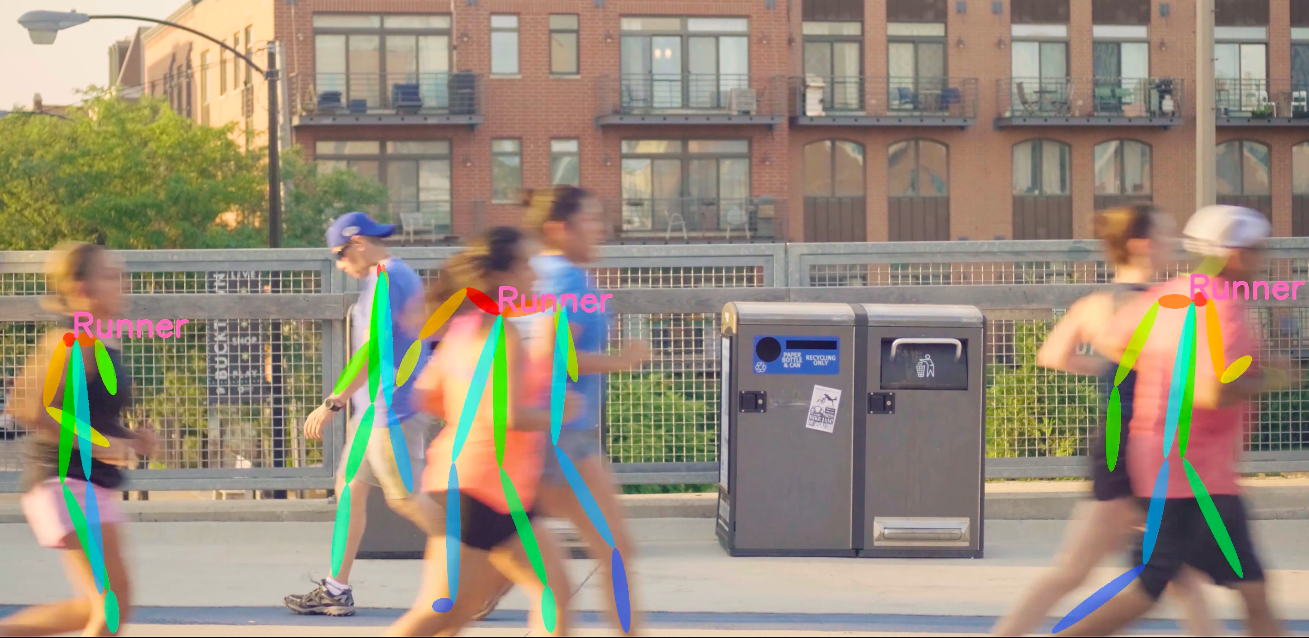
Image analysis and object detection have always been something I'm interested in, my first exposure was writing a Matlab program to automatically detect fluorescent microarray spots and extract the pixel intensity values. A while back I took the Udemy course Deep Learning and Computer Vision A-Z by Hadelin de Ponteves and Kirill Eremenko. One of the projects was object detection using the Deep learning model Single Shot MultiBox Detector (SSD). I wanted to expand on that project and come up with a straightforward way to track the movement of detected objects across multiple classes in video feeds. This is the basis for applications like traffic monitoring, estimating velocity, and security monitoring.
I came across some example tutorials of object tracking in the blog Pyimagesearch. However, those examples are either for tracking single-class object or not recording the object class. So I modified the codes to include multi-class object trackings based on the output of the SSD detection. For this post, I will share the custom functions that I came up with to integrate multiple class and multiple label tracking using OpenCV, as well as posture estimation.
-
When love is not enough

Source: Marion Fayolle, The New York Times. I cringe when I hear people quoting the statistic that half of all marriages end in divorce. Not only it's an outdated measure from a time in the 80s, it's also a glaring example of how popular culture has turned a multi-faceted phenonmenon into a misleading number devoid of any nuances. When I came across the data set National Longitudinal Survey of Youth 1979[1], I decided to wrap those numbers into interactive visualizations for the marriage trend of the boomer generation, and to show that context matters.
The patterns in these visualization are somewhat reminiscent of Eli Finkel's book The All-or-Nothing Marriage, in which he argued that American marriage has shifted from love-based to self-expressive[2], in an attempt to satisfy higher-level needs. As our society adjust to those changing expectations, he noted,
"The pursuit of self-expression through marriage simultaneously makes achieving marital success harder and the value of doing so greater."
-
Getting started with AWS SageMaker - Part II
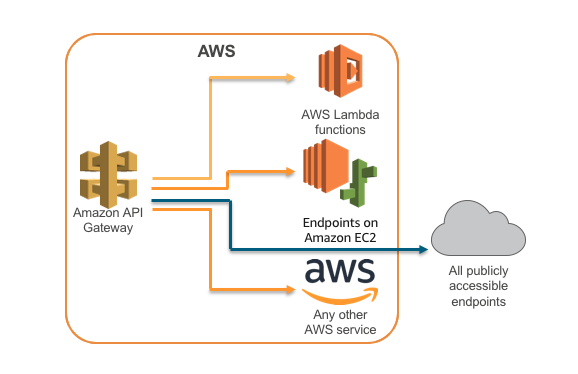
In a previous post, I talked in details about using Amazon SageMaker as a Machine Learning service platform that eliminates the need for backend OS management, so users can focus on the machine learning part. An extension of SageMaker is that the model endpoint can be deployed as a public API through API Gateway with Lambda integration.
-
Handle with caution - making sense of the pandemic data

Source: Southern China Morning Post. In the span of the past month, the American public has been bombarded with numbers, charts, maps...and more charts on the spread of the Covid19 outbreak. While these metrics are helpful in providing an overview for a given region (e.g. county), the nature of the data and how they are collected makes it infeasible in coming up with accurate estimate or forecast of the infection curve. So it was surprising to hear that today Dr.Fauci changed the projection of the U.S. death toll to "more like 60,000", which is a big departure from the estimate of 100,000-200,000 he made just 11 days ago. It makes you wonder how they come up with that projection at the Institue of Health Metrics and Evaluation (which was used to support Fauci's forecast)?
Let's examine the limitation of the data available and shed light on why they are not meant to be used for modeling or forecasting the spread of the virus.
-
Getting started with AWS SageMaker - Part I
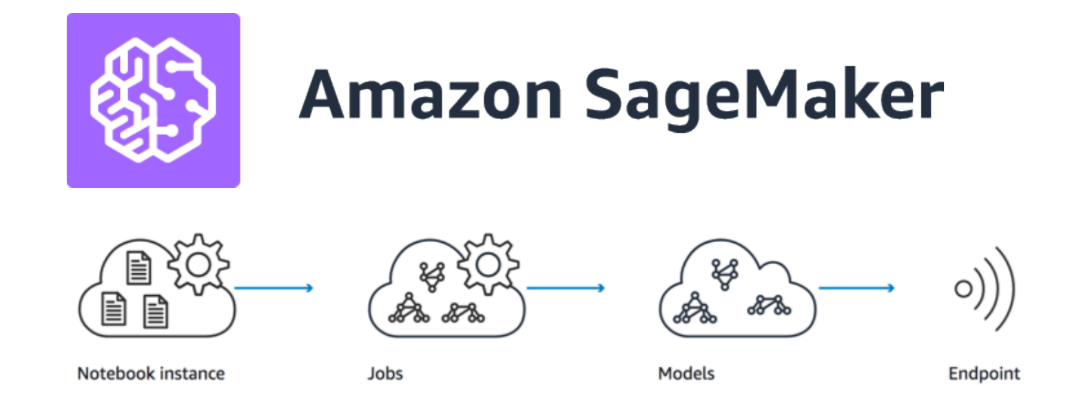
The Amazon Sagemaker is touted as a crucial component for implementing Machine Learning as a Service, and it's a big part of the AWS Machine Learning Certificate program. Out of curiosity, I wanted to see how it works in practice, and how easy it would be to adopt the platform. This blog post is for anyone who wonders about the use cases for SageMaker and its advantages.
-
How to deploy a Flask app with ease
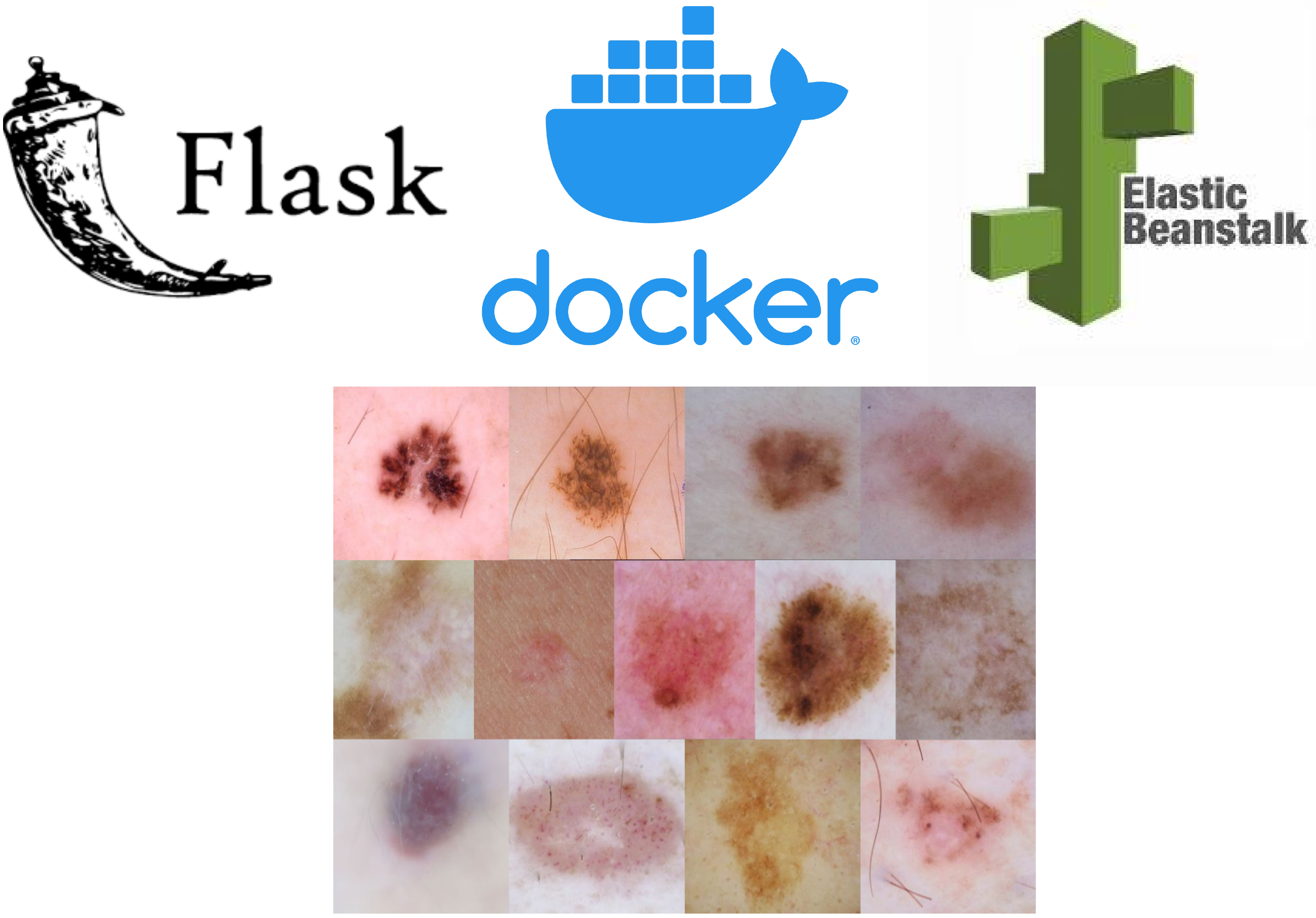
As a Data Scientist, I spend alot of time training, validating, and optimizing models. For a side project, I wanted to try deploying a Deep Learning (DL) classifier model to get my hands on the other layers of the Machine Learning tech stack. Building a web app is a great way to evaluate the feasibilty of the model design and work flow, while showing the value of the machine learning system. For this project, a DenseNet model was trained to predict 8 categories of skin lesions using dermascopic images and meta data (e.g., age, gender). The web app was build in Flask, wrapped in Docker, and deployed via AWS Elastic Beanstalk (EB). In this blog post, I will share the things I learned about the deployment process.
-
Feature Engineering - getting the most out of your data
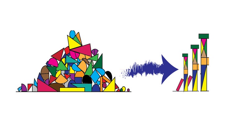
Feature Engineering for Machine Learning (source: Udemy). Throughout my experience in Data Science, I think feature engineering is the one practical skill that didn't receive enough emphasis in textbook or other formal channel of learning (Docker is the other one). It wasn't until I started participating in Kaggle competitions when I realize the value of feature engineering in building machine learning models. Overall, feature engineering is a way to extract more insights from the data based on some domain knowledge (although it's been shown in some cases domain knowledge is not required), in a way that would improve the model's predictive power. This blog post will cover a few of the methods that I found to be useful.
-
A data sketch of the opioid epidemic
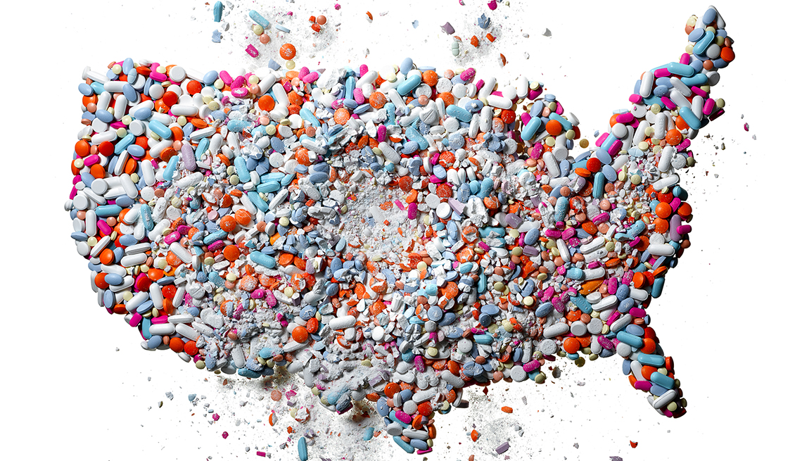
Photo Courtesy of AARP During the past few years, there has been exponentially increasing media coverage of the opioid crisis in the U.S., especially focusing on synthetic variety such as Fentanyl. The CDC estimates that the potency of the synthetic opioid is about 50-100 times as much as morphine, and it has been a lucrative merchandise for the cartel, leading up to the biggest Fentanyl bust recently at the Arizona border.
I came across opioid datasets from the Henry J Kaiser Family Foundation and economic data from the Bureau of Labor Statistics. Using these resources I wanted to examine the potential relationship betwee opioid death rate and economic downturn (i.e, unemployment rate) for each state[1]. Furthermore, the interactive line plot shows that every state has its own trends of mortality from different types of opioid.
-
RetinaNet lung opacity detection (with meta data)
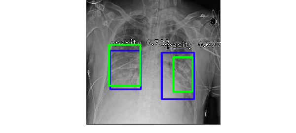
The Radiological Society of North America (RSNA) recently hosted a Kaggle competition, where Kagglers are asked to build a model to screen for marker of pneumonia by detecting lung opacity on chest radiographs. The standard practice for diagnosis of pneumonia is time consuming - requiring review of radiographs by trained professional, vital sign, and clinical history of the individual patient. The quality of the chest radiograph (CXR) also makes accurate diagnosis a challenging task, because the opaque features can be caused by pulmonary edema,bleeding, or fluid in the pleural space [1]. To quote the RSNA:
"They see the potential for ML to automate initial detection (imaging screening) of potential pneumonia cases in order to prioritize and expedite their review."
I tried out the RetinaNet object detector (implemented in Keras by Fizyr) on the image dataset, but unfortunately ran out of time to submit before the deadline. For this post, I will focus mostly on model performance and tradeoff associated with using meta data from the dicom image files. But before going into that, I will explain why I chose RetinaNet.
-
Bayesian approach and probabilistic programming
_resize2.png)
Source:XKCD comic. Most people working with statistical analysis are familiar with Bayes Theorem, but in doing probilistic programming there's a lot of nuances in implementing Bayes theorem. In this post I'll briefly summarize the Bayesian approach and show an example of working with mixed type of data (continuous and categorical) using Python's PYMC3 package (and there will be NO coin-flipping example).
