
UPDATE: Check out this tracker app and write-up launched by the cofounder of Instagram Kevin Systrom. It uses a single metric Rt (effective reproduction number) to summarize the relative spread of the virus based on # of new cases reported and Bayesian update. I find his explanation to be straightforward and the model interpretation to be insightful.
Inconsistency in testing
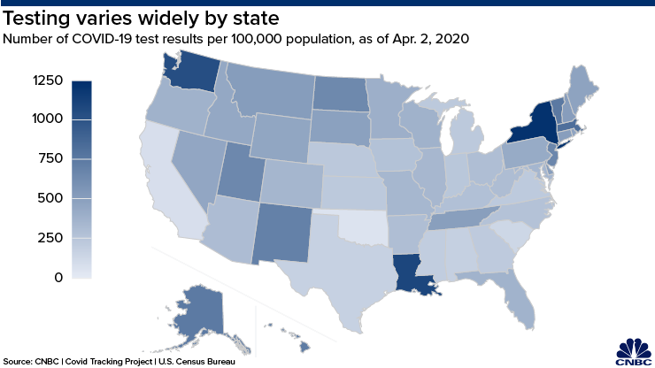
The biggest shortcoming of public Covid19 data stems from inconsistent testing policies between the states. The map compiled by CNBC in Fig.1 shows the range of testing efforts by reporting testing per 100,000 population. The top three states are New York, Louisiana and Washington; the ones lagging behind are Texas, South Carolina, California and Oklahoma.
The number of confirmed cases depend on the number of people being tested, therefore lack of access to testing becomes a bottleneck in collecting data that reflects reality. To compound the problem, some states have shifted back and forth in its testing policy, and that has resulted in backlog jams. A prime example is California, which is still working on its backlog, and has tested less than 0.5% of the state's residents at the time of this writing. In terms of public data released, there is no way to separate the backlogged test results from the other results. All of that means the number that gets reported is often skewed as a function of resources and turn around time, and there is no reliable measure of incidence rate to get a sense of how fast the infections is spreading. Here, incidence rate is defined as the number of NEW cases that develop (and gets detected) within a sample population in a given time period. As a result, media outlets can only report total number of cases and deaths.
Distribution of prevalence rate
Most of the hospitalization rate and fatality rate quoted in reports are averaged estimate across the country or just a few states[1]. All of the demographic data released by the CDC are based on patients who tested positive and showed up at the hospital site[2]. We know that older patients, and those with underlying medical conditions, are more likely to be hospitalized and have higher fatality rate. However, any attempt to project hospitalization or fatality number at a given locality is thwarted by the lack of prevalence data for the demographic group of interest. For clarity, prevalence rate is defined as this:
                       # of disease cases in sample
Prevalence rate  =  ━━━━━━━━━━━━━━━━━━━━━━━
                       Total # of people in sample
The public data set that I have come across are only reporting the numerator and not the denominator, which is the total number of people tested for Covid19 in the study. Currently, there's no data gathered for the total number of people tested within each age group, or each comorbidity group. That is the missing link in estimating the numbers on a granular administrative level, which has its own distinct demographic makeup that can vary significantly from the published CDC study. At best, only some state health departments are keeping track of the number of cases broken down by age groups.
System vulnerabilities
There is an insightful article written by Robert Bracco on why the current model used by public policymakers is deeply flawed. One of the flaws is that the model does not take into account the increase of mortality rate for patients when the local healthcare system is overloaded (think Italy). It is reported that the virus has recently started to spread quickly into rural America, where the population tends to be older and poorer, and local hospitals have scarce resources to handle a Covid19 outbreak. Some of the local clinics have already closed their doors, so it's expected that mortality rate for rural population would be higher compared to its urban counterpart. And it doesn't help that there's currently 7 states that refuse to impose a stay-at-home order, creating a loophole in the containment effort.
Since testing is limited or discouraged for individuals with mild or no symptoms, experts are concerned about a second wave of infection if the governement ease up on the shutdown. Until there are test kits readily available to consumers, the number of death cases serves as the most practical indicator of the impact and scope of Covid19. In early March, German chancellor Angela Merkel said she expects that two-thirds of Germans will be infected with the virus. The question is no longer just how many people will be infected, but also what percentage will develop immunity against a potential(and likely) second wave[3].
REFERENCES
[1]Garg S, Kim L, Whitaker M, et al. Hospitalization Rates and Characteristics of Patients Hospitalized with Laboratory-Confirmed Coronavirus Disease 2019 — COVID-NET, 14 States, March 1–30, 2020. MMWR Morb Mortal Wkly Rep. ePub: 8 April 2020. DOI: http://dx.doi.org/10.15585/mmwr.mm6915e3external icon.
[2]Severe Outcomes Among Patients with Coronavirus Disease 2019 (COVID-19) — United States, February 12–March 16, 2020. MMWR Morb Mortal Wkly Rep 2020;69:343-346. DOI: http://dx.doi.org/10.15585/mmwr.mm6912e2
[3]MIT Technoogy Review, https://www.technologyreview.com/2020/04/09/999015/blood-tests-show-15-of-people-are-now-immune-to-covid-19-in-one-town-in-germany/amp/, April 9, 2020