
Opioid death and Unemployment
The animated chord diagram below is based on an example diagram I found in the D3 gallery page . The top chords display the ranking of death rate in each state as number of deaths per 100,000 with age adjustment, while the bottom chords correspond to the ranking of unemployment rate. The figure only shows the top 25 states.
Fig.1. Animated chord diagram for opioid death rate (age-adjusted) and unemployment rate.
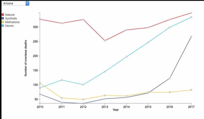
I also created an interactive plot for the different opioid deaths by the number. Here, Natural opioid refers to Morphine, Codeine and semisynthetic; Synethetic refers to prescription narcotics like Fentanyl and Oxycodon (except Methadone). Some states had too many missing values especially early on, so I selected the ones with complete data from 2010-2017 and that returned 33 states. For clarity, the plot is displayed HERE .
Some interesting facts that emerged from the datasets:
- Starting from 2010 to 2017, West Virginia has ranked #1 in death rate.
- In 2017 alone, the highest number of deaths at the state level within each type is as follows: Synthetic -> 3,523 in Ohio , Natural -> 1,133 in Florida , Heroin -> 1,356 in New York , Methadone -> 283 in New York .
- During the second wave of the opioid epidemic (from 2010-2014), the 3 states that had the highest Pearson correlation between death rate and unemployment rate are: Arizona (0.83), Nevada (0.69), and Nebraska (0.65).
Given the sharp rise in opioid deaths, there's been increased public campaigns to inform people about administering naloxone(Narcan), an opioid antagonist, to reverse overdose. Recently, researchers have published a study that examines whether the safety net of naloxone might lead to greater risk-taking among opioid users, and suggests that naloxone might have caused more overdose, with no reduction of opioid-related deaths[2]. Critics argue that the study was built on flawed data, but it brings into question the trade-offs of implementing this systemic intervention, and the effect of that trade-offs remains to be seen. If you are interested in hearing more, check out the Hidden Brain podcast The Lazarus Drug .
REFERENCE
[1] Dasgupta, Nabarun et al. “Opioid Crisis: No Easy Fix to Its Social and Economic Determinants” American journal of public health vol. 108,2 (2018): 182-186.
[2] Doleac, Jennifer L. and Mukherjee, Anita, The Moral Hazard of Lifesaving Innovations: Naloxone Access, Opioid Abuse, and Crime (September 30, 2018). Available at SSRN: http://dx.doi.org/10.2139/ssrn.3135264