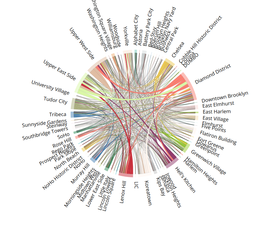
Chord Diagram
There are many flavors of circos diagram depending on the application. To show the flow and magnitude of of the taxi ride data, chord diagam is the most appropriate. The each chord displays the flow or relatinship(e.g., correlation) between different entities, and the metric of interest can be visualized by the width of each chord. The input for the chord diagram is a standard matrix called the 'Adjacency matrix' [1], in which a nxn matrix quantifies the flow from X to Y. In this matrix, the row names and columns names are identical and in the same order. For the taxi data, the rows(i) and columns(j) represent the pick up location and dropoff location, respectively. The matrix value(i,j) is the number of people going from location i to location j, and it determines the thickness of the corresponding chord. To retrieve neighbourhood names from the raw data, I used the Python packages geopy and pygeocoder to extract the neighbourhood information using GPS coordinates for the pickup and dropoff locations.The codes are available here, and the outputs are the matrix json file, and a .csv file with row names and html color codes.
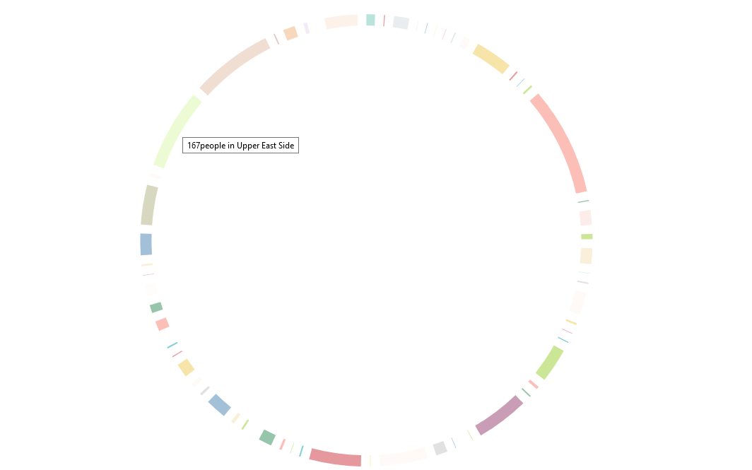
Step I. Donut Chart
The Donut Chart (Fig.1) serves as the backbone of the chord diagram. To make the donut, define the layout with d3.layout.chord()
and d3.svg.arc() . A mouseover function is added to show how many people are leaving that neighborhood.
See complete donut codes here
Step II: Adding chords and text labels
After getting the donut chart, chords and text labels (Fig.2) can be added, with the following additional code:
Step III: Mouseover tool tip and fading
Finally, interactive features are what makes D3 graphics so appealing. To add tool tips showing the number of people coming in and leaving the neighbourhood, a text function is appended to the variable chord. And to apply fading affects with mouseover, go back to the variable "group" to add the functionality. The codes shown below are added to the ones above, and the complete .js code (for the first interactive graph) can be found here.
To embed the D3 javascript into the html, simply call the .js file with the script src ="" function. In practice,
it's common to use div to define the area for D3 effects. For example, in this html
web page, I inserted the D3 script in between a div element with id called "chart" . The id is called in the chord.js file to
select that element by specifying d3.select("div#chart").append("svg").
I found that the fastest way to hack D3 is by looking at well-annotated codes (I love the ones written by Nadieh Bremer ) AND using JSFiddle interactive tool to test out different javascript and see its effect.
REFERENCE
[1] https://medium.com/@Marianattestad/a-treatise-on-making-circos-plots-from-genomic-data-7ff496849e0
[2] How to create a Flow diagram with a circular Twist, Visual Cinnamon, https://www.visualcinnamon.com/2015/08/stretched-chord.html
[3] Andrew's Chord Example http://bl.ocks.org/AndrewRP/7468330